Redesigned the CRM dashboard to enhance recruiter's productivity, resulting in a 50% increase in dashboard visits.
Context
HireEZ is a Series B startup that helps recruiters efficiently find and manage candidates. The previous home dashboard was cluttered, lacked clear action pathways, and provided a suboptimal user experience.
Timeline
Oct'21 - Mar'22 (5 months)
My role
• Identified and resolved dashboard UX friction, prioritized it on the roadmap, driving a redesign that boosted visits by 50%.
• Orchestrated the launch of the AI-powered 'To-do' in collaboration with six PMs, making it one of the top 5 most adopted features.
Team
1 product designer (me),
1 product manager,
8 full-stack software engineers
Problems
Business problem: A cluttered and outdated home dashboard is discouraging new customers and reducing productivity for existing users.
The dashboard made our tool seem complicated and outdated to new customers, deterring adoption. Existing users sometimes missed core features because of complex navigation and overwhelming data. Addressing these issues is vital to enhance user experience and engagement.
User problems: Information overload, difficult navigation, and unclear next steps.
After conducting interviews with five users, I uncovered pain points in their experience with our dashboard. Users expressed difficulty in locating overview information, citing an overload of irrelevant details that made it hard to scan, leading them to often ignore it altogether. They also highlighted challenges in identifying clear actions to take due to the cluttered interface. Additionally, navigating to frequent tasks was described as cumbersome, with scattered navigation paths compounding their frustration.

Solutions
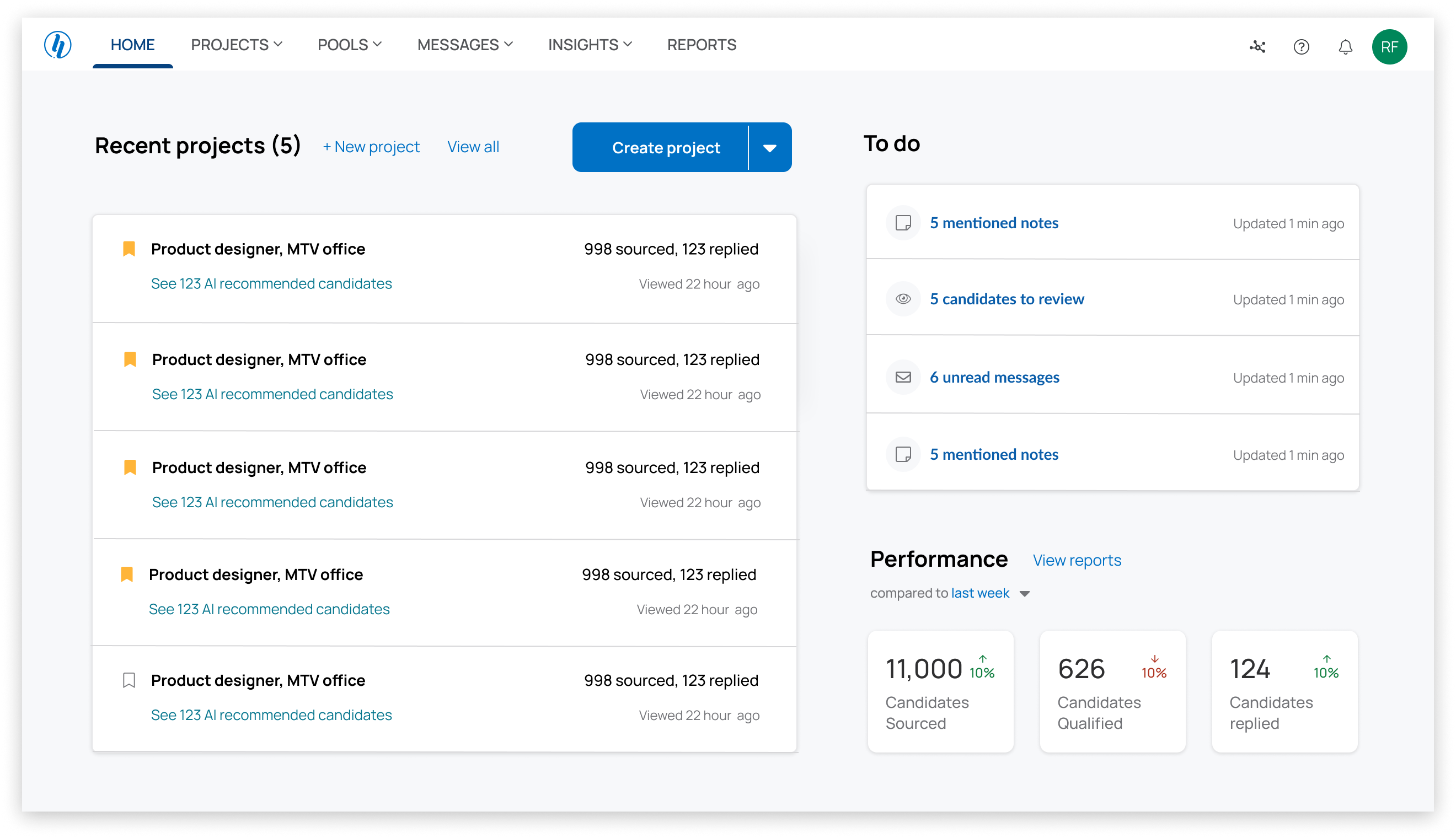
Streamlining workflows and drive actions
I took the lead in making our dashboard much easier to use, focusing on clearing up the navigation and making the main tasks users do every day smoother and faster with better navigation and direct call-to-action buttons.
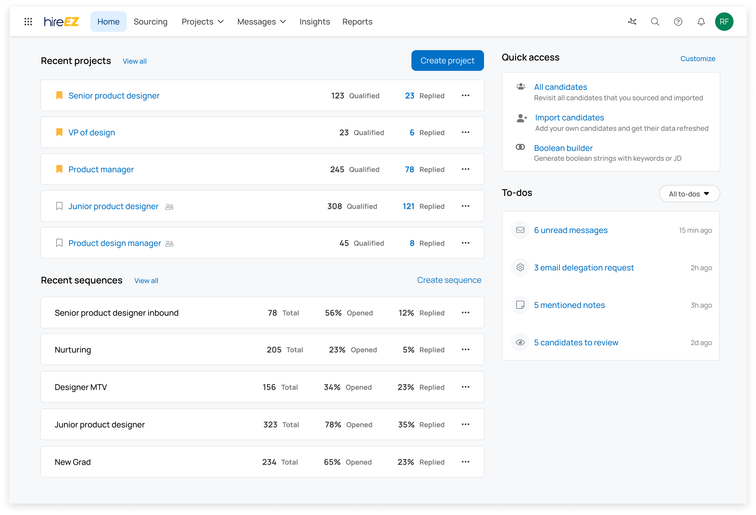
Navigation + Dashboard
The solution I designed includes:
A unified navigation
New dashboard layout
New ''To-do'' feature
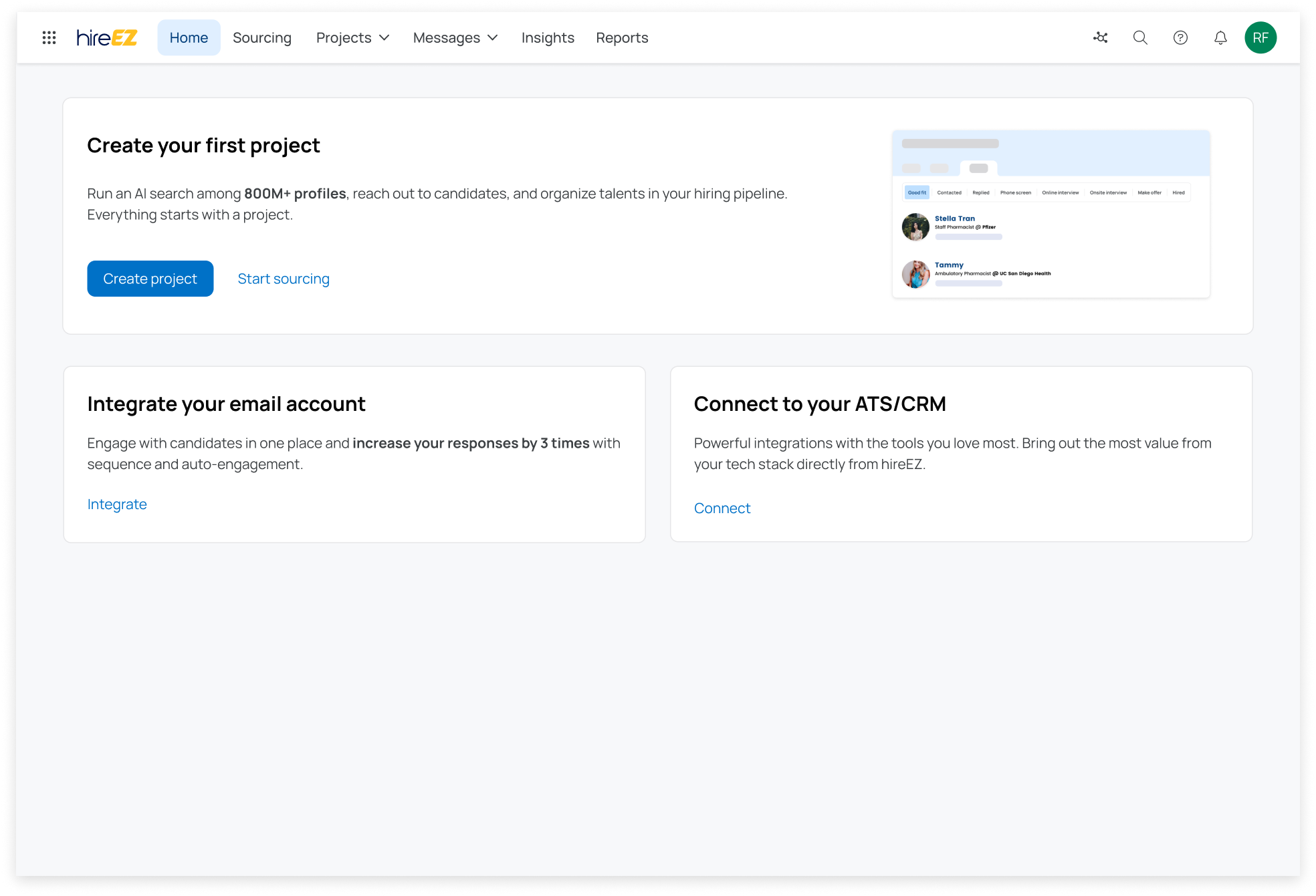
Onboarding and empty stage
Result: 50% increase in dashboard visits, and saved users an average of 15 minutes every day
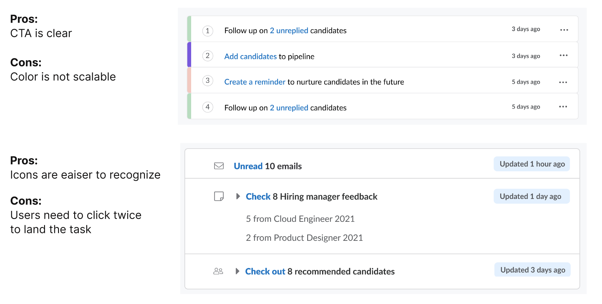
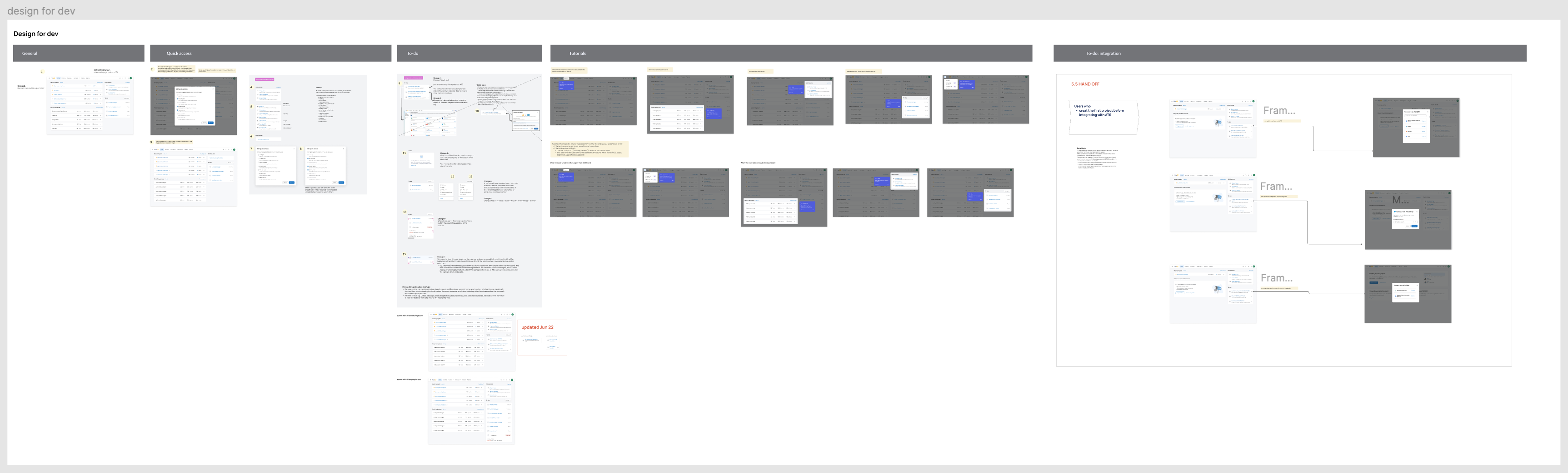
Key process 1: AI-powered to-dos
I defined the logic for AI-powered to-dos by collaborating with 6 PMs across product lines
After my idea for AI-powered to-dos gained buy-in, I led a cross-functional effort to define its behavior. I set meetings with 6 PMs from different product areas to deeply understand their user workflows and how to surface the right to-dos at the right time. We aligned on core trigger logic, including:
• Which user groups should receive the to-dos
• When to trigger them based on key actions or timing
• How often to repeat or refresh tasks
• Where to land users and how to make the content context-aware

I explored multiple UI directions, refined them based on feedback, collaborated with other designers, and finalized a solution that aligned with the new design system.
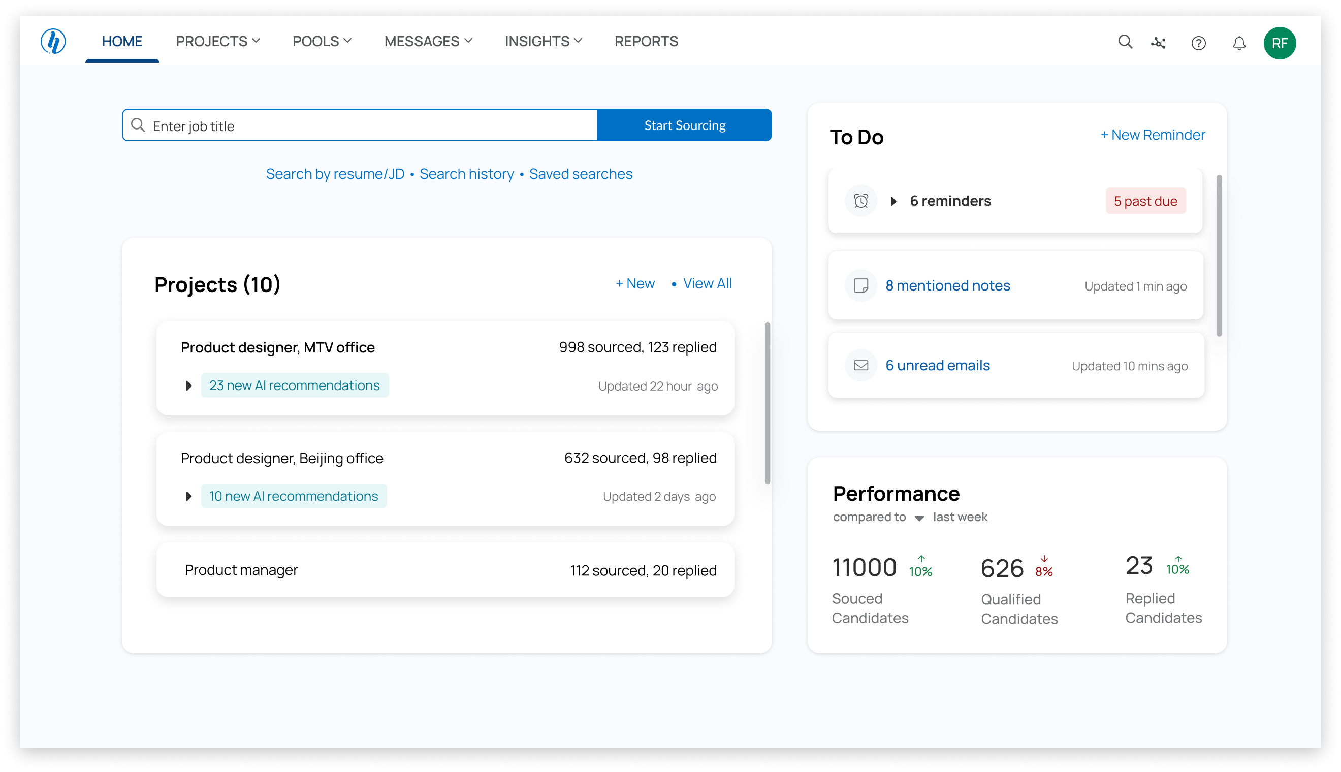
Key process 2: Choose the main CTA with a system mindset — Search vs. Create Project
Gather user feedback
In usability tests with 5 users (conducted alongside my PM partner), we discovered that users expected advanced search capabilities (e.g., Boolean logic). Since our search couldn’t support that level of complexity, leading with search would likely frustrate users.
System-level consideration
Creating a project wasn’t just a single action—it unlocked the broader system:
• Enabled email campaigns
• Structured candidate tracking
• Activated collaboration features
By shifting the CTA to “Create Project,” we guided users into a workflow where more product value could be delivered downstream.
Leadership alignment
I presented the design decision to the CEO backed by:
• User feedback – Search expectations couldn’t be met
• Product data – Higher retention from users who started by creating a project • System thinking – Creating a project unlocked downstream features like email and AI to-dos
This helped us align on the big-picture product flow, ensuring the main CTA guided users into a path that delivered long-term value for both the user and the business.
Conclusion: Start with creating projects for long-term retention
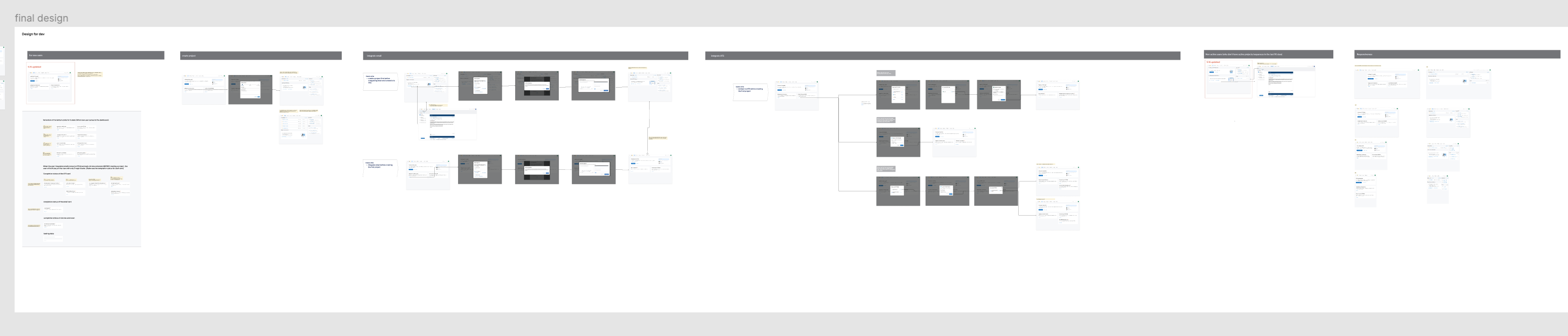
Key process 3: Refining the full experience — Flow, content copy, edge cases and responsiveness
Once the core structure was in place, I focused on refining the end-to-end experience. I mapped out user flows, crafted clear and concise content, and addressed edge cases like empty states and error handling. I also ensured responsiveness across screen sizes to support a smooth experience on both desktop and mobile.
Learnings
Taking initiatives and ownership
The home dashboard is the entry point to our product—it guides users to core features and sets the tone for the entire experience. Redesigning it wasn’t easy. It touched multiple parts of the system, required cross-team alignment, and had high visibility. But I was committed to making it better. I took initiative, drove the vision, and kept the user experience front and center. I actively gathered feedback from teammates and real users, and collaborated closely with PMs, designers, and stakeholders to bring it to life.